Saturday 24 September 2011

Household debt: a look at EU and USA

These days in Europe everyone is concerned about sovereign debt. The truth, that we have momentarily set aside, though is that all forms of debt when incurred in extremis have detrimental consequences.

Let’s take a look at household debt. Nobody is talking about it now that interest rates are that low. It is a fact that mortgage debt comprises a much larger part of total household debt that consumer debt. It is also a fact that in many European countries, mortgages are fixed rate ones (mostly northern European countries) rather than variable rate ones (mostly southern European countries). That means that even in this low-rates environment, for countries that fixed-rate mortgages make up the most part of mortgage debt, debt service continues to be as heavy a burden for households as it was in a high rates environment and negatively affects private consumption. Here are a few charts to help us visualize that.


source: Eurostat

source: Eurostat

As we can see from the charts, retail sales in countries with relatively low household debt perform better than the EA17 average, while retail sales in countries with high household debt burdens underperform relatively to the EA17 average. For all the countries plotted in the charts, the vast majority of mortgages are of the fixed-rate variety, so comparisons shouldn’t be problematic in that respect. 

Another fact is that US households seem to deleverage at a much faster pace than EU ones. Moreover, the households in some of the most indebted EU nations are significantly more indebted than the US ones. Here are the charts. Unfortunately, there was no aggregate figure for the EU so I plotted data for the most indebted EU nations.
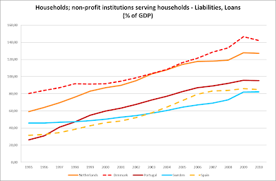

source: Eurostat

source: Federal Reserve Bank of St. Louis, own calculations

Now I want to take a look at retail sales for EU27 and the US. Here’s the chart.


source: Eurostat, Federal Reserve Bank of St. Louis

Of course, as far as the first months of the “recovery” are concerned, the US outperforming the EU27 should be attributed to the low base effect at work, since at the height of the crisis the fall in retail sales in the US was much greater than that in the EU27. What about the months after the low-base effects ran its course though? One part of it can be explained by the chaotic household saving rate differential between the two areas.


source: Eurostat, Federal Reserve Bank of St. Louis

Can this vast outperformance of US retail sales over EU27 ones be attributed to the differential in savings rates or does the fact that US households deleverage that faster play its part ? I can’t help but wonder…

P.S. I forgot to put on the chart about household debt for all EU countries. Since data for 2010 were not available for all the countries I used 2009 data.


source: Eurostat


Monday 19 September 2011

The reason why this was not a "real" recovery

I don’t know if mood swings were that common during the Great Depression but during the present depression mood swings are so dramatic that they can drive people crazy. Until a couple of months ago all we were hearing about was how the global recovery was more robust than we thought. Guess what, now we have swung to the other extreme end of the mood spectrum were only doom seems imminent.
Of course, truth is that the recovery was never robust and it was at best something superficial, a mere “upwards correction” to borrow a market term. A statistical hiccup if you prefer. I have written about this in the past (here, here and here).

Lately, I was thinking about long term unemployment and how catastrophic and destabilizing it can become for a country’s society and economy. It is no secret that long-term unemployment is a curse, that erodes people’s skills and self-respect and ultimately any sense or capability of self-preservation. 

In order to have a better look I plotted long term unemployment’s change between 2007 and 2010 along with change in GDP (a year before the crisis’ breakout and a year after that). Here’s the scatter plot.


source: Eurostat

These are panel data for the EU countries, not for the entire bloc though, since for some of them such data were not available.

As you can see, bar for 5 countries (out of which for 2 of them the decrease was negligible), long-term unemployment increased during this last “recovery”. 

In my book, one of the distinguishing features of an actual recovery is whether long-term unemployment decreases. It serves as an indicator of the momentum of any expansionary forces at work, since the economy has the strength to re-employ workers left redundant by defunct sectors (in most cases). A sign that the economy is healthy and can dodge any obstacles.

Even in the post 2001 recovery, that was not without strains, long-term unemployment decreased. Back then the heavy lifting, in picking up workers left jobless from the de-industrialization trend at work in the Euro Area, was done by low-level services jobs and construction. Could the housing booms that took place in a lot of Euro Area countries have been the region’s last resort in employing “unskilled” (by that I don’t mean to be disrespectful to anyone) workers?


source: Eurostat

As you can see at the chart, in some countries, long-term unemployment increased during this period. These were all eastern European countries, which in order to transform their economies from the centrally-planned model into the free-market one, had to endure some years of intense pain, so that the structure of their economies could adjust to the new reality. This process was totally different from what was happening in the rest of EU, hence they are kind of an outlier. On the contrary, 2 out of 3 countries, where long-term unemployment decreased significantly during the present “recovery” were from that bloc (Poland and Romania). I guess what goes around comes around.

I am not known to be optimistic, more like the exact opposite, but for what it’s worth, I can’t see any sector being ready to step in and absorb any future jobless workers coming potentially from the services sector, the financial sector or even the government sector if things get ugly in the Euro Area…


Saturday 17 September 2011

The Greek services sector and what's holding it back...

The technological content/degree of sophistication of an economy’s products and services and their added value usually go hand in hand.

One of the prevailing trends in the so-called developed countries (a group that Greece is considered to be part of, miraculously) for the past 20 years is the transition from industry/manufacturing to a services-heavy economy.

As it is natural then the countries that are able to offer the most sophisticated services with the highest added value possible, will be the ones whose citizens will enjoy the highest living standards.

Services in particular, since they are labour-intensive and not capital-intensive, rely heavily on knowledge and human capital so that they can increase the added value they generate.

In this particular respect as most of us probably expect, Greece ranks desperately low in the overall EU table. Unfortunately the data I found are for 2008, a bit dated, but with the stagnation that’s plaguing the Greek economy I doubt that the picture has improved.


source: Eurostat

Here’s a chart about employment in knowledge intensive services-related occupations (or knowledge intensive services – KIS, as Eurostat calls them). Greece is a real laggard compared to most of its EU peers, even when compared to countries that are considered as emerging markets. 

According to Eurostat, knowledge intensive services are: 
  1. Knowledge-intensive high-tech services: Post and Telecommunications (64); Computer and related activities (72); Research and development (73),
  2. Knowledge-intensive market services (excluding financial intermediation and high-tech services): Water transport (61); Air transport (62); Real estate activities (70); Renting of machinery and equipment without operator, and of personal and household goods (71); Other business activities (74),
  3. Knowledge-intensive financial services: Financial intermediation, except insurance and pension funding (65); Insurance and pension funding, except compulsory social security (66); Activities auxiliary to financial intermediation (67)
  4. Other knowledge-intensive services: Education (80); Health and social work (85); Recreational, cultural and sporting activities (92).
As I mentioned above knowledge intensiveness and labour productivity (I hereby used Gross Value Added per person employed as a proxy) go hand in hand. Well, here’s a regression using panel data from EMU countries, showing just that. Unfortunately the dataset had to be shaved down considerably for the data to be comparable. Nonetheless, I think that the message that the chart gives away is crystal clear. The red dot is Greece.


source: Eurostat, AMECO, own calculations

Here’s the scatter plot for another regression using panel data for EU countries, concerning employment in knowledge intensive services-related occupations and GDP per capita. A you can see, when one takes into account Greece’s level of GDP per capita, it seems that a disproportionately low % of Greece’s total labour force is employed in knowledge intensive services occupations. Greece comprises a bit of an “anomaly” in the dataset. Again, in the chart, Greece is the red dot.


source: Eurostat, own calculations

Could this be an objective indicator that Greece’s level of GDP per capita was artificially pumped all these years due to the running of general government deficits, while our economy’s fundamentals were geared towards a lower GDP per capital level? I don’t know if that is so, but it surely means that the Greek economy remains parochial and outdated…


Sunday 11 September 2011

Greek exports update : a look at export quantities

After a conversation I had yesterday with fellow twitterer @nikan about whether Greek exports are on an upward path or not, I thought to do one more post on the subject.

In my humble opinion the best way to judge the trajectory of exports is to take a look at exports' quantities. Since exports tend to be volatile I used 12-month moving averages in order to smooth out the fluctuations and (maybe) be able to discern the trend.

In order to save space (and maybe bore you a bit less) I have plotted only the exports of product families that account for a large part of exports and those that posted sizeable increases. Here's the chart about overall exports broken down into intra-EU and extra-EU.

source: Eurostat

As we can see the spike in Greek exports is attributable in its entirety to the performance of extra-EU exports. A good question is whether there is an across the board increase or is the spike concentrated in a couple of segments. I think that the next chart is going to clarify this.


source: Eurostat

As you can see the rise in extra-EU oil products exports is phenomenal. Keep in mind the magnitude of the increase so that you can compare it with that of other niches in the next charts.

Exports of industrial supplies, primary or processed, are mostly flat. The exception is extra-EU primary industrial supplies that exhibit a strong downward trend. Industrial supplies (or intermediate products) account for a rather large chunk of overall exports quantity.

source: Eurostat
source: Eurostat

Next I want to take a look at exports of capital goods and similar products for the sole purpose of displaying how small a part of total export quantity they comprise. Here are the charts about capital goods and transport equipment.


source: Eurostat

source: Eurostat

Finally, the last export segment that I chose to include is that of processed food&beverages, since, quantity-wise, it is the most important of consumer goods and it cuts a rather impressive/weird chart.


source: Eurostat

It seems that, presently, this niche too is not in any noticable upward trend and if there is any increase in exports value that should be due to pricing. But I can't help wondering about this monstrous hickup during the 2008-2009 period and exactly what it means. It certainly means that there is untapped potential. If anyone can come up with an explanation please do so in the comments section.

To wrap this up, the brunt of any export growth seems to stem from extra-EU oil products shipments. Pretty much the same conclusion we had reached at the last post about exports. Greek industrial products exports don't seem to post any growth, unless of course, since 2007 and on, technology has changed that much and the said sectors' produce has grown somewhat lighter (which I somehow doubt). Only industrial supplies are important quantity-wise but high value-added segments like capital goods and transport equipment seem to be negligible. Even sectors like food and beverages where Greece could claim to possess some kind of comparative advantage seem relatively stagnant. All in all not a pretty picture and certainly not one that could help employment-wise...

Tuesday 6 September 2011

Some systemic thoughts on free trade and capital mobility...

As I usually do, I was trawling through some data today and came across a really interesting tidbit.

In the next chart I have plotted the total amounts outstanding for debt securities issued by EU non-financial corporations, denominated in EUR. 


source: Eurostat

As you can probably make out from the chart, since early 2010 there has been a slight downward trend in the total amounts outstanding of debt securities. This has never happened again in the time for which data are available. Well, I know that 1991 isn’t a long time back, but all the same this is a rather significant apparition. All other declines in amounts outstanding were mere blips but this seems to be something of a higher order.

During the past few decades, access to funding for corporations has risen to an unprecedented scale. This particular fact along with deregulation and the opening of emerging markets' trade and capital accounts has increased international trade volumes and capital mobility significantly.

Of course, one could say that the total amount outstanding of debt securities is dwarfed by the size of bank credit and that this remains the main funding source for firms. We should keep in mind though that, at least in the EU, only the larger and most respected corporations have access to the bond markets, i.e. the crème de la crème of the corporate universe. 

Besides bank credit is also stagnant and I can’t see any reason why it would resume an upwards move anytime soon.


source: Eurostat

 To complete the roundup, we could take a look at equity, the last remaining funding source for firms (except from retained earnings that is). 


source: Eurostat

Those possessing even the most superficial knowledge of technical analysis could be asking themselves whether this resembles a Head and Shoulders formation in the making, well I do ask myself the same question (this is not a call on the direction of equity prices so don’t treat as such)…

Could all this be something more than a blip? Could this signal some systemic changes? Could this signal that the time of free trade and free capital movements is slowly coming to a close? All the facts outlined above tell me that the firing power of firms will be reduced and in such times of crisis, the other factor determining capital mobility, regulatory changes, is a bit of a wild card. The other time that something similar did happen was during the Great Depression. If you ask me the current background picture right now bears some striking similarities with the one back then… 


P.S. I want to make clear that this is in no way a politically-coloured post or anything of that order. I just tried to give an interpretation of a few facts that I think of as quite startling.


Friday 2 September 2011

Internal devaluation and the continuing plight of the Greek industrial sector

Internal devaluation (i.e. the slashing of labour costs) is supposed to work like a currency devaluation, meaning that its ulterior motive is to make a country’s products more competitive overseas. 

Greece has embarked on such a mission since last year in an effort to make its tradable sector’s output more competitive.

Thus I want to take a look at how Greek industrial production is faring from 2010 and on.

I’ve plotted the performance of the industrial production index for the main aggregations of industrial produce for Greece and Ireland since they have also pursued a similar policy.


source: Eurostat

Greek production of intermediate goods is plummeting and the same goes for Ireland.


source: Eurostat

Greek production of energy which is heralded as the great hope for Greece is in a downward path too.


source: Eurostat


Production of capital goods which seemed to have stopped falling incessantly in the fashion of the aftermath of the 2008 crisis, this year appears to have resumed its move downwards.


source: Eurostat


The same goes for consumer goods, which in the cards is supposed to be the most “defensive” sector of all.

I used the industrial production index and not the industrial turnover index which is affected by price fluctuations and does not reflect actual production dynamics.

The most worrying inference from the charts above is the fact that while average industrial production for EU16 has rebounded after the crush, the one for Greece has not. With the exception of intermediate goods, Irish production has rebounded as well. 

What I can infer from the trajectory of Greek industrial production is that an overwhelmingly large part of it is still channeled inwardly and not overseas. Of course, to be fair, with domestic private demand so weak in the vast majority of EU countries it is not exactly easy to gain exports share. 

To get back on the internal devaluation front, the problem is not that labour costs are not going down, the exact opposite rather. Here’s the relevant chart.


source: Eurtostat


Of course, benefits such as those generated by an internal devaluation-like adjustment are not recorded overnight but in the fashion of the j-curve effect they might take some time to appear on data. Truth is though, that by now we should have seen some signs of them. Could this mean that the size of the downward adjustment is not enough?

Despite the falling real labour costs, Greek producer prices for industry are not following suite. Of course this is easier said than done, since for the most part of the 1st half of 2011 and a large part of 2010 commodities prices were on an upward tear and also let’s not forget that the credit crunch in Greece is here to stay.


source: Eurostat

And here are producer prices for the non-domestic market.


source: Eurostat


As we can see, as far as the non-domestic market is concerned, the PPI for the Irish industry has been declining, the same cannot be said for Greece of course.

A good question that I cannot help asking is the following: isn’t industrial sector in its most part capital-intensive? In my book this means that most part of its cost is dictated by its material inputs and not by its labour inputs (a look at balance sheets of industrial firms could verify that). Hence, what we could achieve by an internal devaluation (if material inputs prices were constant) is to make Greek industrial produce cheaper, provided that material prices in all the countries that we compete with behave in the same way. This is a pretty big if and a quite unrealistic one in my view, since the Greek market is a rather small one and a rather inefficient one. Besides, prices of imports in a country that is flirting with bankruptcy can be rather difficult to forecast and are not bound to be lower than those for other countries. The exact opposite seems more possible. 

Here’s the chart for import prices for industry, which shows just what mentioned above.


source: Eurostat

Apart from that, Greece is dominated by SMEs which in most cases are not as cost-efficient as larger entities (of course there are exceptions to this rule).

I have to say that the current conjuncture where commodities prices were rising were not the most favourable for such ventures. Of course the structure and size of the Greek market are not favourable either.

In my humble opinion the one sector that internal devaluation could help the most (at least in the current environment) in the way of being more competitive, is services, were labour costs comprise the largest part of the overall costs. True to that, tourism according to anecdoatal evidence seems to have had a good year despite all the other reasons that could have served to hold it back. For Greek industry to become more competitive the size of the internal devaluation should be larger (of course this is a rather painful path which bring about rather unpredictable social effects). Besides, most currency devaluations are larger than the decline in Greek real unit labour costs.

All these are my personal views and could very well be totally wrong. A good question is what’s the way forward for Greece? I wish I could answer that. What I can say is that high unit labour costs is indeed a boon for Greece’s competitiveness but not the only one. Low productivity springs to mind immediately and along with it all the other factors that could drive it upwards…

Of course, it sure is easier to tap your keyboard than make policy decisions, since this whole situation requires striking  a fine balance between economic policy choices and political ones...