Thursday, 27 September 2012

Greece: High Income or Middle Income...?

I’ve been reading a few papers lately regarding the Middle Income Trap. It made me think about Greece. 

The World Bank runs a classification ofcountries to Low Income, Lower Middle Income, Upper Middle Income and High Income according to their Gross National Income per capita level. Greece is currently classified as High Income. This classification of course is desirable but is it sustainable and was this propelling of Greece to High Income status built on solid foundations?

Development is a rather wider notion than growth and it encompasses all kinds of aspects (and as a consequence the relevant indicators). If I wrote about all these, then the word-count and probably chart-count would go through the roof, so I’ll narrow it down with the danger of violating the statement that I just made about development and growth. So, besides growth metrics and relevant indicators, I’ll include a few indicators about governance.

If you want to take a look at a definition of Gross National Income, you can see how the OECD defines it here.

To draw some conclusions I look at Greece, Portugal and one of the World’s most widely cited success stories, Korea. These three countries share one feature; they crossed the $12,476 High Income watermark, the same year, namely, 2003 (Greece is the dark blue dot, Portugal the dark red one and Korea the light red one).


source: World Bank

source: World Bank

 From 2003 to 2008, where the peak for the above countries lies, Greece recorded the highest growth, followed by Korea, while from 2008 till 2011 Greece registered the biggest decline too, followed by Korea and not Portugal, maybe skewed by Korea’s larger reliance on international trade (great trade collapse 2009) and faster population growth (since this is a per capita figure).


source: World Bank, own calculations


To cut to the chase, I think it is really interesting and revealing to take a look at a decomposition of growth over the past 20 years.

Since, there are no data, at least that I know of, dissecting growth for these particular countries I tried to derive it myself using a rather primitive method. I took all GDP components, at constant Local Currency Units (as the World Bank puts it) and calculated each year’s change. Then I simply plotted the results for each of the three countries. It is rather facile, but I think that it is adequate to give us an idea of where growth came from. As a final note I want to remark that I used Gross Capital Formation, instead of Gross Fixed Capital Formation since the former includes changes in inventories.

Here’s the chart for Greece.


source: World Bank, own calculations


Now, the chart for Korea.

source: World Bank, own calculations


Finally, here’s the respective chart for Portugal.


source: World Bank, own calculations


Now that we have a full picture I can try to draw some conclusions. Out of the three, Greece’s growth that led to its ascend to High Income status (1993 – 2003), was mostly based on internal sources, i.e. private final consumption, Gross Capital Formation and to a lesser degree General Government Final Consumption. For a limited number of years (1997 – 2000), Exports made a satisfactory contribution. After Eurozone accession, growth came almost entirely from internal sources, namely, private final consumption and gross capital formation. 

Now, what about Korea? Before the Asian crisis broke out (1993 – 1997) growth came from Household Final Consumption Expenditure, Gross Capital Formation (adding weight to the notion that the fact that Korea ran a current account deficit during this time was due to machinery imports since it was building its industrial capacity). After the crisis, growth was based more on the external sector and to a much lesser extent to private final consumption. Gross capital formation’s weight was reduced too, compared to the pre-crisis time, maybe due to the fact that services were gaining in importance in the Korean Economy. 

Now Portugal, is a mid-point between the two extremes analysed above. Pre-Eurozone membership, growth was based on private final consumption and gross capital formation (the country underwent some kind of a boom in the construction sector). After the country exchanged Escudos for Euros, growth stemming from private final consumption was considerably subdued, while growth from gross capital formation was totally absent. Exports contributed more than they did in the previous period.

To sum it up, Greece’s growth after it attained High Income status came from its internal sources in its entirety, Korea derived the lion share of its growth from its external sector and Portugal lies somewhere in the middle.

Something that can and does shapes the trajectory of growth and where it comes from is governance. Here are some select indicators from the World Bank’s Worldwide Governance Indicators.

The first indicator is Control of Corruption.


source: World Bank


After entering the High Income group, the said indicator for Portugal is in broadly constant. The same, unfortunately, cannot be for Greece, which recorded a very low reading for 2011, while some progress had been made from the years prior to EA membership. Korea made some progress compared to the nineties but lately it appears that progress in that particular field has stalled.

The next indicator is Government Effectiveness.

A look at this indicator will produce some rather contrasting conclusions. While reading for Korea is in constant ascent, the same readings for Greece are in free-fall, with the country recording a very low reading again in 2011, the worst out of the three. As far as Portugal is concerned while during the first years of Euro membership readings were as good as those in the run-up to membership, after that, readings receded showing some complacency after the target was achieved. 


source: World Bank
  
The final governance indicator that I’ve plotted is Regulatory Quality.


source: World Bank


For Greece, there was some considerable improvement right after Euro accession compared to earlier years but a rapid fall ensued and again the country recorded the lower reading out of the three in this instance too. Respective reading for Portugal showed a slightly lower reading after the EZ membership goal was reached and a considerable fall in 2011. On the contrary, Korea is here too steadily rising. I think it is adequate to say that while the country exhibited the lowest reading for 1996, it did manage to rank higher than the other two countries in 2011.

Another feature of High Income countries is usually that their produce possesses a higher technological content. One area that this can be exhibited is a high % of knowledge intensive services (I’ve looked into that in an earlier post) but for countries just crossing the High Income threshold, the main arena that this is manifested is (even after the sustained de-industrialization that the western world has sustained for decades now) the % of value added that manufacturing of different technological content corresponds to.

Here’s Greece.


source: OECD

Here’s Portugal.


source: OECD

And finally, here’s Korea.


source: OECD

A few quick takeaways from the charts are more than enough to portray a rather clear picture. The technological content of Greek manufacturing is extremely low and manufacturing accounts for a very low share of total value added. In Portugal manufacturing accounts for a significantly larger share of total value added and the technological content is higher than that of Greece, but still is low. Korea is intensely industrialized and high tech along with medium-high tech manufacturing takes up the bulk of manufacturing value added.

There are some common themes that can be discerned from the charts, low and medium-low tech manufacturing produce an ever-decreasing chunk of value added. On the other hand in Portugal and Greece high and medium-high tech manufacturers show more resilience but just that, while in Korea, until recently they have been growing quite fast. 

I would like to include more indicators painting a fuller picture but, unfortunately, data for these are confined to the last few years.

To get back to my original point, my skepticism regarding Greece’s ascent to High Income, apart from the qualitative aspects outlined above, had to do with the sources (domestic sector growth) and its sustainability.

The sectoral balances of the engines of Greek growth, the general government and household sector more specifically, should give us a hint of the sustainability of Greece’s High Income status.


source: AMECO, own calcualtions

As the chart makes apparent, Greek households were and still are overextended (not getting into the reasons here). To acquire a more sustainable footing, significant scaling down of spending and scaling up of savings is needed. Given that this was the main engine of growth this past decade (the High Income decade) it becomes apparent that this is going to have (and already has) significant negative consequences on GDP and GNI. Portuguese households are less extended due to higher saving and lower investment but are significantly leveraged (not shown by this indicator). The trajectory of interest rates is going to be of paramount importance for Portuguese households then. Both countries’ household sectors have to scale back (immensely more in the Greek case) and this is going to be painful. Austerity being applied to both countries does make households more strained due to deterioration of incomes and increases in taxation hence making households’ deleveraging immensely more difficult. 

Finally let’s take a look at the general government.

The said deficit for Greece is still monstrous, making further austerity-only induced adjustment strenuous. Portugal’s case is more contained but further adjustment is still going to be very painful due to the simple fact that not all sector can deleverage at the same time without monumental pain ensuing.


source: AMECO, own calculations


To wrap this up, Greece did evolve after crossing the High Income threshold the way only natural resources-rich countries do. With weak governance, facing a gradual thinning of an already weak and with low technological content, manufacturing base and an increase in low-knowledge content services as well. If you’re wondering what played the role that resources play for aforementioned countries, you just have to take a look at the two last charts. In the original question that the post posed, my answer is that should Greece have been in another part of the world, it would have been a middle income country (and probably one stuck in the middle income trap). Though, since in my humble opinion location does matter, situated in Europe and being part of the EU and later the Eurozone (membership played an important role in Greece’s ascent since it is the reason for lower interest rates and transfers of EU funds), means Greece can be a borderline High Income country…

Friday, 31 August 2012

Greek current account deterioration in the 00s: a few factors left unsaid

Lots of commentators claim that the deterioration in the Greek current account can be blamed on the country adopting the Euro. Well, if you just look at aggregate figures it may seem that way.


source: Eurostat

If one bothers to drill down a bit more then a slightly different picture may start to emerge. Let’s take a closer look then.

One factor that contributed to the widening of Greece’s current account deficit was the drying out of current transfers from European Union after Greece’s accession in the EMU.


source: Eurostat

Next I would like to take a more detailed look at the merchandise trade balance (according to the SITC classification).

The relevant balances for Food,Drinks&Tobacco and Chemicals were essentially flat over the 1995-2011 period.


source: Eurostat, own calculations

Now let’s take a more detailed look the individual balances that contributed to the deterioration of the current account.


source: Eurostat, own calculations


Out of all the sub-accounts of the merchandise trade balance the one having the biggest net contribution to the widening of the current account deficit is the Mineral Fuels balance. I think it is obvious that the deterioration of this balance have nothing to do with the deteriorating competitiveness of the Greek economy per se, but its wide deficit is due to structural factors and buoyant demand over the 00s.

The Machinery&Transport Equipment balance deficit widened significantly during the run-up to Greece’s accession in the EMU and then narrowed exhibiting widening spurts which contributed in the periodical deteroration of the overall deficit (like for example in the 2005-2008 period when Greece recorded the widest current account deficit in the years that my data run). This occurrence underlines one single fact, that the household consumption bubble that Greece experienced in the 00s was the driving force behind the current account’s trajectory. This was a demand-pull phenomenon. Investment in machinery and investment in transport equipment were both quite robust in the 00s so the fact that the balance improved simply means that GDP expanded more than said imports and that the driving force was due to other factors (i.e. demand-driven).

I think that the next chart is interesting in this respect. 


source: Eurostat, own calculations


Our next stop is the Other Manufactured Goods balance, which deteriorated as well. I would like to highlight a couple of points. First, notice that the deterioration commenced before Euro membership was a reality but nonetheless continued during the 00s. Second, during the 2005-2008 period when this particular balance recorded its highest deficit these past 15 years, the Greek private consumption bubble reached its apogee, something which in my humble opinion means that at least part of this deterioration was again a demand-pull phenomenon. Undoubtedly, part of the widening of this balance can be attributed to falling competitiveness. But what part of it is due to the Euro’s strength and what part of it should be blamed on the accession of the Central-eastern European (CEE) countries and the explosive growth of their exports? I can’t apply econometrics to give you a precise answer, but I can attempt to shed some light with the next few charts. We shouldn’t forget that (at least in the start, since now CEE countries have upgraded their export baskets while Greece has not) Greece’s basket of merchandise exports was quite similar with that of certain CEE countries.

 The next chart can serve as further evidence of the validity of the claim that households’ final consumption was the main catalyst behind the said balance’s deterioration.


source: Eurostat

Of course, correlation is not causation but this a rather close fit, don’t you think..? If you believe that this would usually be the case, then take a look at the same chart for Germany, that did not experience a households’ final consumption bubble. Not such a good fit, is it?


source: Eurostat, own calculations
 
Now a simple observation. If the widening of the merchandise trade deficit could be blamed on Greece’s loss of competitiveness then Greece must have recorded significant losses in its market share as far as goods exports are concerned. This is not the case here.


source: Eurostat
 
A further takeaway from the chart above is that the slowing down of growth in Greece’s export market share coincided with the acceleration of growth in the respective shares of Bulgaria and Romania. Again, correlation is not causation but…

Finally. let’s take a look at the services balance. Here too the claim was that Greek services exports suffered due to Euro’s strength. Well, I have a chart here that might tell a slightly different story.


source: Eurostat, own calculations

As the EUR strengthened relative to the USD, the balance improved and later in the decade, as the EUR weakened after 2009 it improved as well. Can someone seriously believe that currency fluctuations are the only factor at play here? International trade is such a multifaceted affair that very careful and painstakingly-detailed analysis is required to get a whiff of the factors leading to such changes. Besides, looking at balances does not always tell the whole story since changes could be driven by the import-side or the export-side.

Once again the post is very long, so I'd better wrap this up. I think that changes in the Greek current account cannot be attributed to the Euro’s strength/weakness. The widening of the deficit in the 00s is, always in my humble opinion, mostly a demand-driven affair. If one wants to dig further, deeper structural problems of the Greek economy will start to emerge (e.g. the composition and stationarity of the country's export basket or the miniscule external sector/lack of international orientation of the majority of businesses, etc.). Naturally, some part of it can be attributed to loss of competitiveness but what part of it is due to the emergence of new exporters and what due to currency-induced, reduced price-competitiveness? This is my point exactly, claims that loss of competitiveness can be blamed on currency strength alone border to the simplistic…

Saturday, 18 August 2012

Current account adjustment in Southern Europe: not too shabby


I know that the adjustments that several European nations are undertaking right now are a touchy and controversial issue but I want to zero in on facts tonight.

The current account adjustment is progressing quite fast in Southern Europe, admittedly not the first place that springs to mind when thinking of successful current account adjustments right now.

Of course I’m talking about Spain and Portugal, whose current account deficits were quite sizable during the run-up to the current depression. Currently though, their external sectors performance seems stellar.


source: Eurostat

Goods exports’ growth for both of them steadily outperformed the Euro-Area (EA) average after the great trade collapse (i.e. 2009). There are two things that I want to highlight. Firstly, Portuguese goods exports seem to buck the declining growth trend prevailing in most EA countries. I do not know whether this will continue to be the case if the slowdown deepens but their current performance is not something that one should ignore. Secondly, Spanish goods exports seem to slightly underperform the EA average now that things appear to slow down (Again I do not know whether this is of significance).

When it comes to services’ exports, both countries outperformed the EA average again, with Spain being the one that managed to buck the trend here, until Q1 2012 that is, when it succumbed and joined the bandwagon.  


source: Eurostat

If we look at quarterly data for the current account balance then the improvement becomes very much apparent.


source: Eurostat

Of course, both countries' external sectors are not as large as Ireland's to take up the slack from crumbling domestic demand but you got to start from somewhere and this is definitely a step in the right direction for these countries in their respective efforts to find a more sustainable footing. Admittedly, if the slowdown deepens then the brunt of the adjustment would have to come from the imports side and this would make it much more painful…


Thursday, 2 August 2012

Euro Area: the lower educated unemployment timebomb


I would like to take a look at unemployment and to be more specific, at unemployment among people of a relatively lower education level, mostly during the 00s. The reason is simple. The Euro Area’s economy seems to be getting more and more geared towards activities that require workers to have acquired a higher education level and there is the distinct risk that people of lower education will get excluded.

There are a number of secular trends at work here that make up the current picture of employment/unemployment in the Euro Area.

One of them is deindustrialization. Some people claim this is due to outsourcing or delocalization of activities in lower-cost countries. I think that this is indeed happening but to a much smaller degree than conventional wisdom wants it to be and that most of the deindustrialization we are witnessing is due to the closing down of firms in the sector (for a number of reasons) or the increased automation/mechanization of production processes at the plant level. What’s more, in the remaining activities, at least in some Euro Area countries (not in my native Greece), there is a shift towards high or medium-high technology manufacturing. Finally, due to the new technologies, production processes is possible to be dissected with certain parts of them, mostly those that require less skilled labour, being moved to lower-cost settings. Of course this being a world under constant change, more and more parts of processes that require more skilled or better schooled labour are possible to be delocalized.

Here’s the chart showing unemployment in the Euro Area by educational level.


source: Eurostat

Of course, as with all aggregate figures this is disguising some considerable disparities among EA countries.

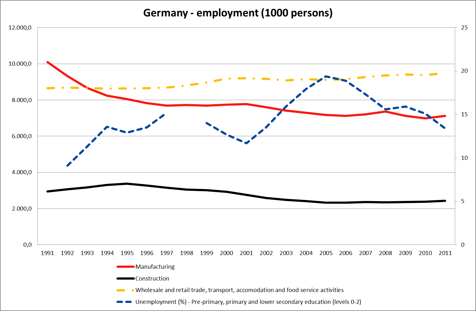
I would like to approach the issue not from a regulatory angle but from a sectoral angle, i.e. which sectors absorbed unemployed workers with lower education and which ones shed workers during the current depression. My working hypothesis is that lower education workers are mostly employed in manufacturing, construction and wholesale and retail trade, transport, accommodation and food service activities. To make things easier, from now on, I will call the last sector as retail trade. Here we go.

There may be some considerable differences among EA countries labour markets but they share some common characteristics. The first one is deindustrialization that translates into the manufacturing sector shedding workers and the second one is that the sectors that absorbed unemployed workers of a lower education were construction and retail trade. I would like to try and group EA countries into some distinct classes.

The first one includes those that underwent a credit boom which morphed into a construction boom (I won’t characterize those booms as bubbles or not), hence saw a considerable spike in construction employment. Another common feature members of this group share is that after their respective property crush occurred, unemployment went through the roof.

One of them is Ireland. 


source: Eurostat

As we can see in the chart when, manufacturing employment was stable and employment in retail trade (etc.) and construction was growing, unemployment was falling. When manufacturing employment started to fall, despite the strong growth in retail trade and construction, unemployment among workers of lower education remained broadly stable. One explanation I can think of is that many ex-workers that had dropped off the labour force came back and tried to get a job or that new jobs required more skills. When the crisis hit Ireland like a ton of bricks and all sectors pictured laid-off workers, the unemployment rate increased almost four-fold. 

Another one belonging in this class is Spain.


source: Eurostat

The story here is pretty much the same with Ireland except that manufacturing employment decreased only marginally as the 00s progressed, hence, unemployment eased a little bit further. Maybe after a while jobs created by the retail trade and the construction sector are not as suitable for workers with a lower education background (or maybe unregistered employment and a possible inflow of immigrant workers played a role here). Unfortunately I do not have such detailed data on the subject to delve deeper here.


source: Eurostat

Finally, here’s Estonia, that also went through a building boom. The unemployment rate here decreased significantly during the 00s, as it seems that a bigger number of lower education workers were absorbed by construction and retail trade. An explanation could be that the relevant sectors in Estonia were less sophisticated (than their counterparts in Ireland and Spain) so workers were more suitable for alternate employment here.

The second class is made up from countries that didn’t experience a construction boom, hence the unemployment rate there remained mostly unchanged.

One of them is Belgium.


source: Eurostat

Just before the 00s rolled in there was a substantial drop in unemployment among workers with a lower education background. During the 00s though, manufacturing employment decreased steadily bringing the relevant unemployment rate at the level it stood at the beginning of the decade.

The next one is Austria.


source: Eurostat

During the decade, employment in all sectors featured in the chart was broadly unchanged and unemployment among workers with lower education, remained in a 6%-8% range without any significant moves.

I will include Netherland here too, that like Belgium experienced a sharp drop in unemployment right before the 00s, and then moved in a range during the decade. The crucial difference among the two cases is that the level of unemployment in the Dutch case is half that of Belgium.


source: Eurostat

A third class would have to include countries where the relevant unemployment rate increased after the crisis broke out but I’m skeptical whether the rate will indeed remain lower than the level it stood before the 00s.

The first one here is France.


source: Eurostat
 
As we can see in the chart employment in construction and retail trade hasn’t budged since the crisis erupted and the spike in unemployment can be attributed solely to the decrease in manufacturing employment without growth in some other segment this time to square things off. With growth this low I somehow doubt it that employment will remain unchanged in construction and retail trade.

The next stop is Italy. Unemployment in Italy is lower than France, mostly due to the fact that the pace of deindustrialization is slower here (at least employment-wise). Again, construction and retail trade haven’t shed any workers and I find it hard to believe that his will continue to be the case in an environment of recession or stagnation if one is very optimistic.


source: Eurostat

We’re done with the countries that can be classified in distinct categories, so here come the “special” cases.

The first one is Portugal.


source: Eurostat

In Portugal, during the 00s the construction sector was in constant retreat and with the manufacturing sector shedding jobs all through the decade, the unemployment rate steadily increased.

Now let’s take a look at Finland.


source: Eurostat

After a fierce crisis in the early 90s, unemployment in Finland went vertical. But Finland is one of the few countries that managed to turn the tide and reindustrialize in the 90s. As a result, along with robust increases in construction and retail trade employment, the relevant unemployment rate fell from above 23% in 1995 to 12,8% in 2008. After the crisis broke out though, unemployment increased on across the board lay-offs. The relevant unemployment rate at almost 17% is rather high even for Euro-Area standards.

Finally, here’s Germany. 


source: Eurostat

Germany is the only country in the Euro Area that the relevant unemployment rate is in a downward path since 2006. It still is rather high, standing at about 15%. Workers with a lower education background were not absorbed by construction or retail trade in this case. Unfortunately, more detailed data are needed here to produce an explanation, something that I don’t possess.

The post is already too long, especially for summer reading material (although admittedly there’s nothing normal about this particular summer), so let me wrap this up. If one conclusion can be reached, it is that despite differences in local employment markets one common theme can be discerned: unemployment among workers with a lower education attainment is rather high in the Euro-Area. The reasons that brought unemployment down during the 00s are not in place anymore (in most cases) and no one should have thought them to be sustainable. This can only mean one thing, the Euro-Area needs a new growth model since this one’s definitely broken. What's more, in a time that the welfare state European model might come under pressure this will only serve to put more pressure on it. When a whole category of people are excluded from the labour market, this can spell trouble in a whole set of different levels and can have spill-overs in a whole lot of others. Construction and consumption booms were maybe Euro-area’s last chance to defer finding solutions to this rather serious problem. Let us be assured, the fact that these past years an enviable social calm loomed over the Euro Area, it doesn’t mean that we can take it for granted. Problems like this one, undermine exactly this. By all these I don’t mean that solutions to such problems are easy and it sure is way easier to tap your keyboard than solve such deep rooted problems owed to secular shifts, the thing is that the problem remains though…


Tuesday, 17 July 2012

Export market shares momentum and its connection with internal devaluation success

Anyone that has taken a even furtive glance at the titles of my posts must have noticed that the catalysts behind export growth particularly interest me. This is particularly interesting for the countries undertaking internal devaluation since exports are in most cases the major driver behind GDP growth.

Eurostat publishes stats for export market shares. What’s more it publishes the 5-year rolling growth rate of export market shares. I think that this data-point is of particular significance since it captures the trend in each country’s competitiveness.

I wanted to run a regression between the 5-year rolling growth rates in export shares  and the average growth rate of real exports for years 2010-2011 (after the 2009 great trade collapse). Here’s the scatter plot.


source: Eurostat, own calculations

As the scatter plot makes rather obvious the 2009, 5-year growth rate of export shares can produce a quite good forecast of the next 2 years average growth rate of real exports. Of course, this is a rather facile and over-simplifying claim and what’s more this is an ex-post claim when everything tends to appear to be clearer.

Nonetheless, this is a point that no-one has actually brought-up in the current debate regarding export-led growth. Namely, a country with declining competitiveness, that is losing export market share fast will find it harder to turn the tables than a country which is gaining market share.

Furthermore, a rather worrying fact is that all western European countries are witnessing their export market shares decline fast. Even, the, admittedly, more dynamic (but not without their own sets of problems and not decoupled from their western neighbours) Central Eastern European (CEE) countries, are witnessing their export market shares rise at a declining pace.

Since it would take many pages to post the charts about all European countries, here are the charts about those that are (or were) in the midst of internal devaluation processes.


source: Eurostat

source: Eurostat

A quite important indicator of whether internal devaluation will be successful or not, is the size of a country’s external sector, along with its dependence on domestic demand. But this is not enough. Ireland, is a perfect example to back the above claim. Its external sector and small dependence on domestic demand, made internal devaluation less painful, always compared with other countries (for example my native Greece). Nonetheless, the growth of real exports was lackluster. Maybe the country’s declining market share can be blamed.

To wrap this up, the above puts to show how much a multi-factorial affair the success of internal devaluation is. And the overall momentum of a country’s external sector as well as of the whole of its economy seems to be rather crucial…