Wednesday, 17 August 2011

Charting the reasons behind Euro Area's stagnation...

No good news for Euro Area hitting the wires lately, while there is certainly no shortage of bad news.

Of course, regions don't find themselves into such a mess overnight, but this is rather the result of  a long-term process. So I’d like to take a step back and look at the bigger picture. Here we go…

Here’s a chart showing real GDP growth in the Euro Area over the last 15 years.


source: Eurostat

The next chart shows annual Euro Area growth dissected according to the sector it originates from. 


source: ECB/Eurostat

As we can see, for the past 13 years, the financial sector was the top growth generator for the Euro Area, followed by trade (retail+wholesale) and industry. On the other hand, agriculture and construction didn’t contribute much to aggregate growth.

A good question is where did this growth come from. In general, growth can either come from gains in productivity or from an increase in inputs.

Of course the picture varies according to the sector and is by no means uniform. So, maybe we can take a look at productivity and labour input dynamics for each sector.

First, let’s have a look at how each sector fared as far as labour productivity is concerned. For the charts to actually be legible I’ve plotted them in groups of three.


source: ECB/Eurostat

Cumulatively, Agriculture fared better than Trade and related services, while construction declined marginally (of course we have to bear in mind that productivity in agriculture is heavily influenced by swings in the price of agricultural commodities). 


source: ECB/Eurostat

Among the remaining sectors, the top performer was Industry, while Financial Services’ cumulative productivity growth for the period was negative and Other Services were exactly flat.

So how can Financial Services along with Trade account for most of aggregate growth in the Euro Area if their productivity growth is stagnant of even declining?

The answer lays at labour force dynamics and labour’s movements among sectors. So here is the percent of total labour force that is employed in each of the aforementioned sectors.


source: ECB/Eurostat

Employment in Industry and Agriculture has declined over the said time period, while the share of the labour force that is employed in Other Service Activities, Financial Services and Trade rose steadily and significantly. The crisis halted the prevailing trends in sectoral employment, at least in most of the sectors that had seen their share in employment rise during the past few years.

So, here’s the answer to why Financial Services and Trade were the top performers in the growth table. The void left by their stagnant or declining productivity was up to a point filled by the ever increasing labour input channeled to these sectors. But in the long run this is not enough.

Even with a cursory glance, one could realize that labour’s being piled into sectors whose productivity is growing slowly or even outright declining. If you want one more reason for the fact that Euro Area’s growth over the last 15 years or so is in a downward trend look no further, here it is…

P.S. Of course there are lots of other reasons that can be claimed to play a role in the slowing of growth that the Euro Area experienced over the past few years, I just wanted to zoom in on that one in today's post... 

P.S.2. Here's the chart about overall changes in sectoral productivity over the Q1 1995 - Q1 2011 period. 


source: ECB/Eurostat, own calculations


Wednesday, 10 August 2011

Some additional thoughts on why Greeks save less...

I know that I've talked extensively about the fall in Greek savings rate witnessed after the onset of the new millenium and EMU accesion but I want to add some further thoughts on that.

I personally despise cliches but some times there is some truth in them or, if you prefer, as the Greek proverb claims "where there's smoke there's fire too".

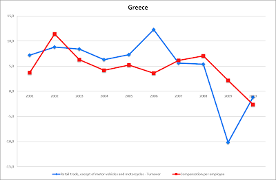
Another reason due to which gross savings plummeted, that I didn't really touch on in the two previous occasions that I wrote about this (here and here), was an increase in private consumption. Take a look at the following chart.


source: Eurostat, ECB


As you can see, during the 2003-2007 time interval, retail sales growth outpaced wage growth, which can only mean that people either saved less or financed their additional consumption through taking on more debt, or both. This was what actually took place in Greece. Here's the evolution of gross savings rate.


source: IMF

As you can see after 2003 the gross savings rate plummeted. At the same time households satrted taking on more debt. Part of that debt was used to finance house acquisitions but another part was maybe used to support consumption (unfortunately I don't have any data about that, so this is conjecture). According to IMF, in Q1 2011, residential real estate loans accounted for 21,9% of total loans exteded by the Greek banking sector. Admittedly, Greek households are among the least indebted in the EU, nonetheless their indebtness increased exponentially during this period. This is what matters really, since in order to service debt, households have to equally decrease their spending and saving. Here's the chart.


source: Eurostat

But what brought on this change in the consumption behaviour of Greek households ? After Greece became part of the Eurozone, Greek people for the first time experienced living with a "hard" currency, something that made imports cheaper and spurred their spending. Imports balloned after Greece became part of the EMU.


source: AMECO


And if you want a more detailed breakdown of the categories of expenditured towards whom additional households' consumption was channelled take a look at the following chart.


source: Eurostat

I plotted Harmonised Index of Consumer Prices (HICP) item weights for certain categories of households' expenditures that rose in importance during the period pictured. When the weight of a certain category of expenditure rises this means that it accounts for an increased chunk of total household spending.

Well, that was it. Appart from all the other reasons (demographic or not) that I had cited in my two previous efforts to de-code the fall in savings rate maybe this one has to be taken into account as well...


Friday, 5 August 2011

The wealth effect : the EU version

I don't think that much have been said about European households' assets. Here's a couple of charts about that with obvious implications.


source: Eurostat

Here's households' owneship of equities, listed or not. Unfortunately data for 2010 are available for very few countries so there was not point using those.


source: Eurostat

And here's data about households' holdings of securities other than shares, meaning bonds, bills, debentures and financial derivatines.

Countries whose households are the largest holders of such securities are more likely to be affected by positive or negative wealth effects. This could mean something or it could mean nothing really. The contingent size of the wealth effect depends on the dispersion of ownership of such securities, i.e. how large the % of households that hold such securities is and how large a % of their wealth they comprise.

After the 2000-2003 period, when markets dropped substantially, in most EU countries households' savings rates did not spike, they remained almost constant. The reason was that back then this was, if you allow me the characterization, just a recession, but the 2008 crisis was just that a full-blown crisis. As a result household saving rates did spike in most countries regardless of wealth effect or not due to the depth of the crisis.

I have plotted gross household savings rates for select EU countries in 3 charts. I used the trajectory of the households' savings rate as a proxy of whether ownership of equities is widely dispersed or not. Of course this is not a foolproof way to distinguish that, so take this with a pich of salt.

First, there are the countries that following large equity market corrections, households' gross savings rate spiked significantly. I therefore, conclude that households' wealth took a hit because of that and households retrenched until their wealth increases again. Moreover, during bull markets for equities the savings rate fell. Hence, equity ownership should (or could be) relatively widespread.


source: Eurostat


Then there are the countries that households seem to have high equity holdings but savings rates didn't post any substabtial moves post-equity market corrections. Could it be that equity holdings are not that dispersed or is it that saving rates were considered to be high enough by households or were stretched enough as it is ?


source: Eurostat


Finally, there the countries whose household sector has relatively high equity holdings but while saving rates didn't budge back in 2000-2003 they surely did spike after the 2008 crush due to the crisis force (always in my humble opinion).


source: Eurostat


These are all conjecture, so they could mean something or they could mean nothing at all...